Reimagining MOHAI
Native Cultures and Stories
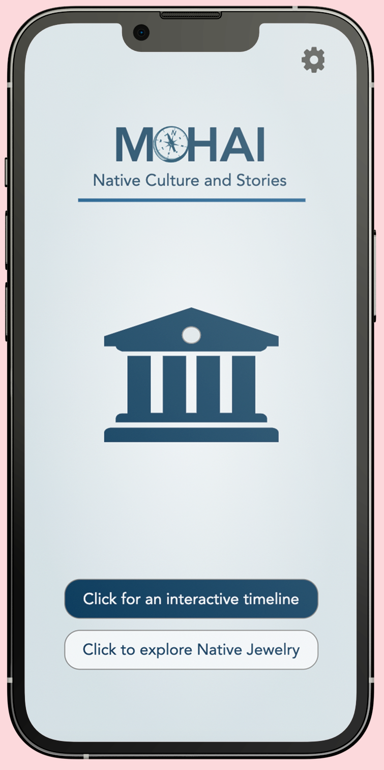
This project explores the design process of developing an app platform for the Museum of History & Industry's Native Ground exhibit. It outlines the design and layout considerations we made when designing the app.
We were asked to update the current Native Ground exhibit in MOHAI to be more interactive and accessible. We needed to create an app platform that effectively displayed information about various artifacts, honored Indigenous communities' stories and traditions in the Pacific Northwest, and provided an immersive, educational experience for museum visitors of the Native Ground exhibition. We were challenged with presenting a large amount of information about various Indigenous artifacts and jewelry in a way that was interactive, user-friendly, visually appealing, and did not overwhelm users with an excessive amount of text.
Defining the Problem
The design problem we addressed through this project was ideating how to create an app platform that actively engages the visitors at the museum by offering online interactive tools that correspond with each Native Ground exhibit to enhance the learning experience.
Challenges- An app that displays information about various artifacts honoring Indigenous communities' stories and traditions in the Pacific Northwest.
- An app that provides an immersive, educational experience for museum visitors of the Native Ground exhibition.
- An app that will allow for a more interactive and accessible visit.
What:
Museum visitors of all ages and backgrounds interested in learning about Native American history
and culture in MOHAI
Who:
For museum visitors of all ages and backgrounds interested in learning about Native American
history and culture in MOHAI
When + Where:
App for MOHAI's Native Ground exhibit in Seattle
Design Process
Conducting InterviewsWe started by creating a template for a semi-structured interview to address the main concerns of going to the MOHAI museum, museums in general, and the technology used to determine what problem our product should target.
-
We chose this type of interview because they include the questions we prepared, but they also allocate space to ask spontaneous follow-up questions so we can ensure that we leave the interview with no lingering questions or doubts.
-
Our interview data overall showed us that people think that museums tend to be boring when exhibits are non-interactive or if museums are popular, they are crowded, and information is hard to read from far away.
Taking these responses, we decided to create an interactive, educational app that enhances the physical museum’s native ground-focused exhibits with informational pages on the app.
Design Thinking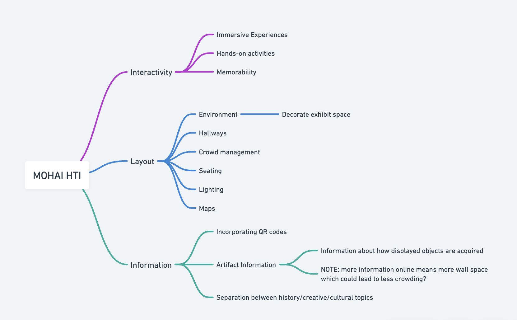
This is the Hierarchical Task Inventory (HTI) we created for our project. In our HTI, we had split our tasks into three categories: interactivity, layout, and information.
Design Phase
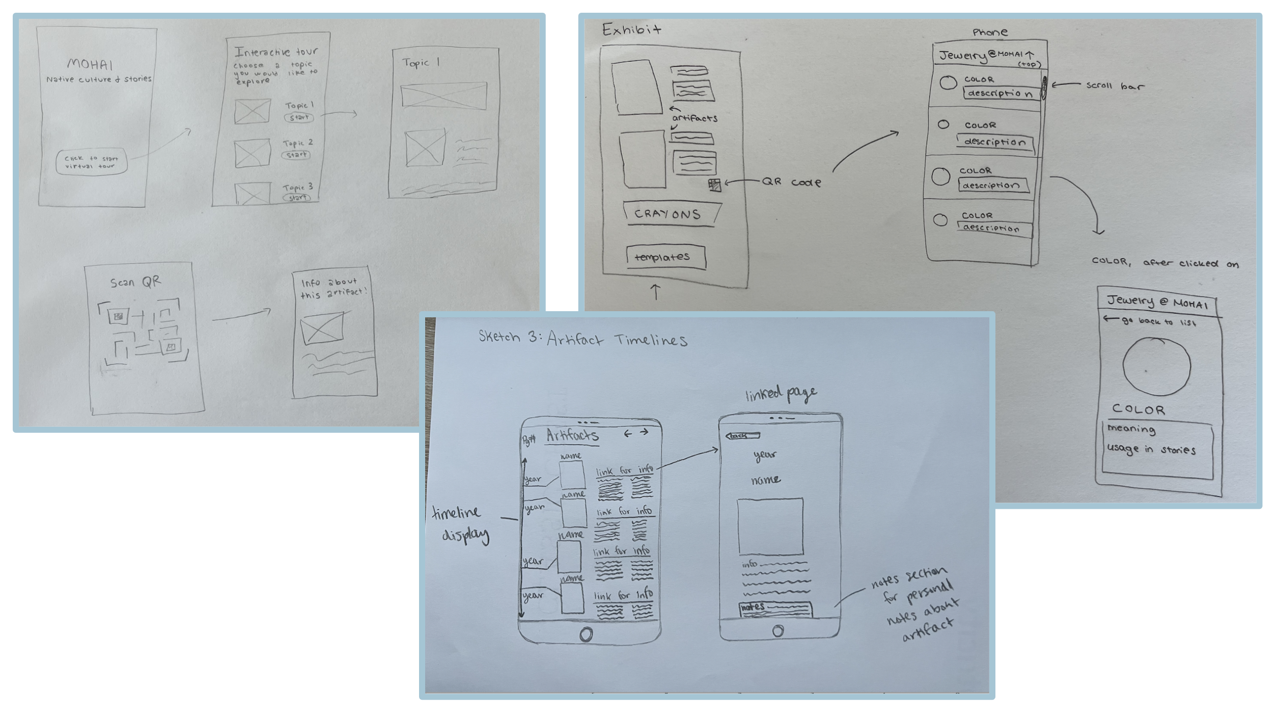
In our initial idea, the main aspects of our app are the timeline of historical events and the jewelry-making section which ties to a physical activity that users will be able to do in the museum.
-
The interactive timeline page displays different dates of Indigenous artifacts, allowing the museum visitors to explore the historical progression and significance of these artifacts.
-
The jewelry-making page provides the native significance of each beads color offered for the activity in the museum.
-
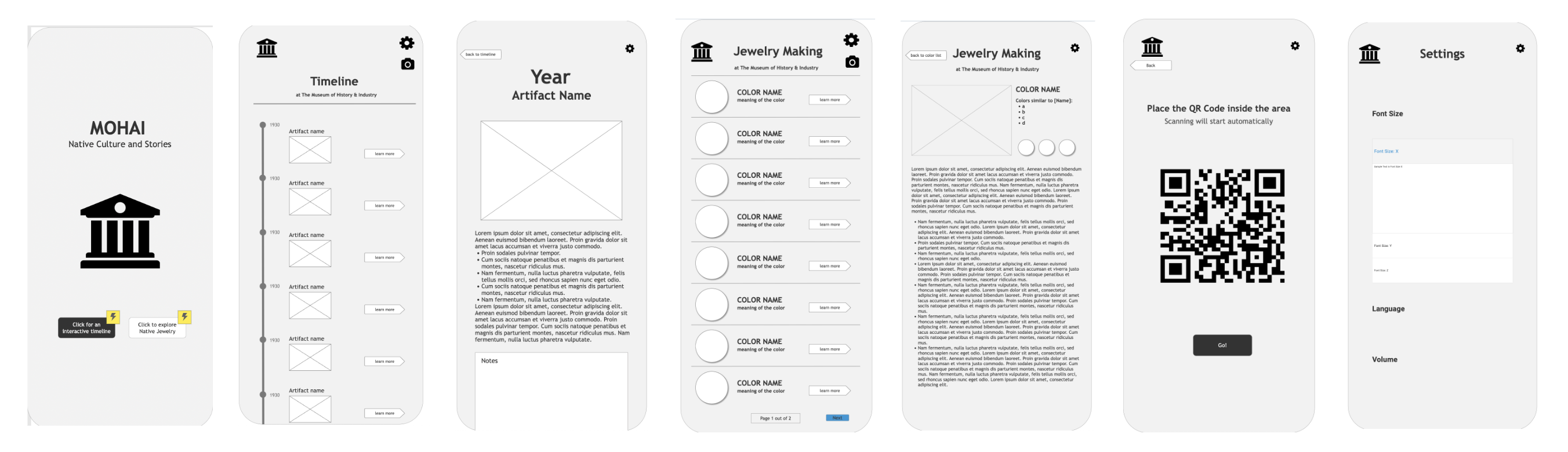
We included a QR code so users can scan physical QR codes around the museum for more information on exhibits. These were our initial sketches for our app idea.
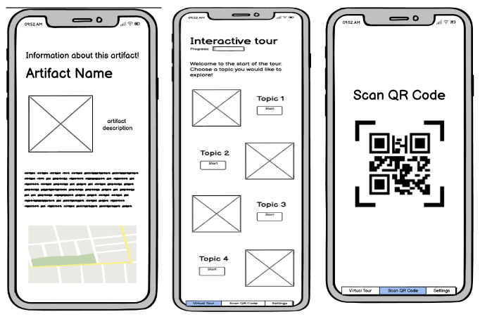
Task 1 - For this wireframe, we decided to focus on creating an Artifact Guide app that can help museum visitors learn more about Native stories, expanding on the exhibits at MOHAI. Users could select topics to learn more about the exhibits or use the incorporated QR code scanner to scan QR codes around the exhibits to learn more about them
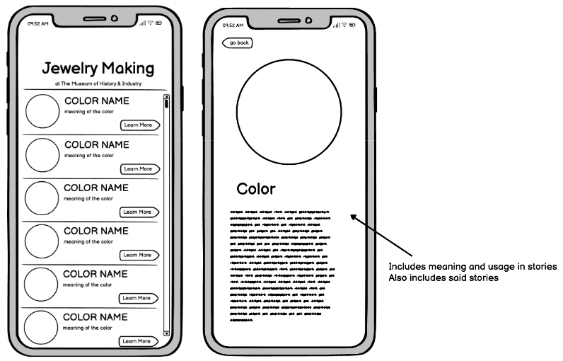
Task 2 - For this wireframe, we decided to focus on the premise of an interactive jewelry-making exhibition added to the kid's area in MOHAI, serving as a pathway to introduce a younger audience to Native Stories. This app would allow the users to discern the meaning of different color beads and learn the meaning behind them in more detail
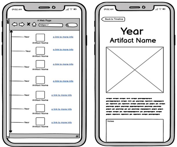
Task 3 - For this wireframe, we decided to create a timeline app in order to express information about the exhibit over an overarching timeline.
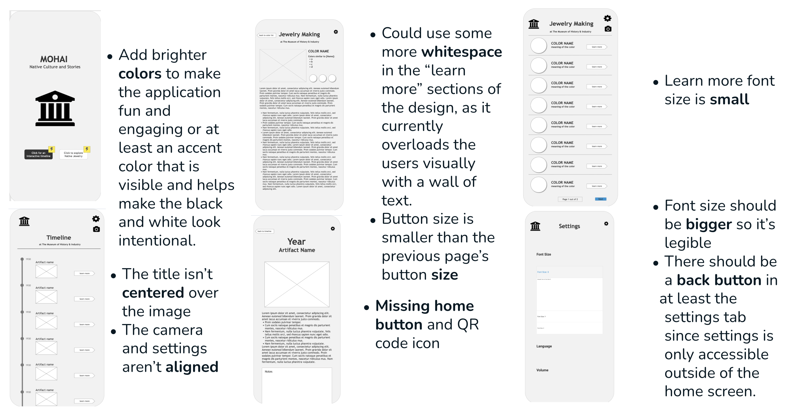
Formative User Feedback Received: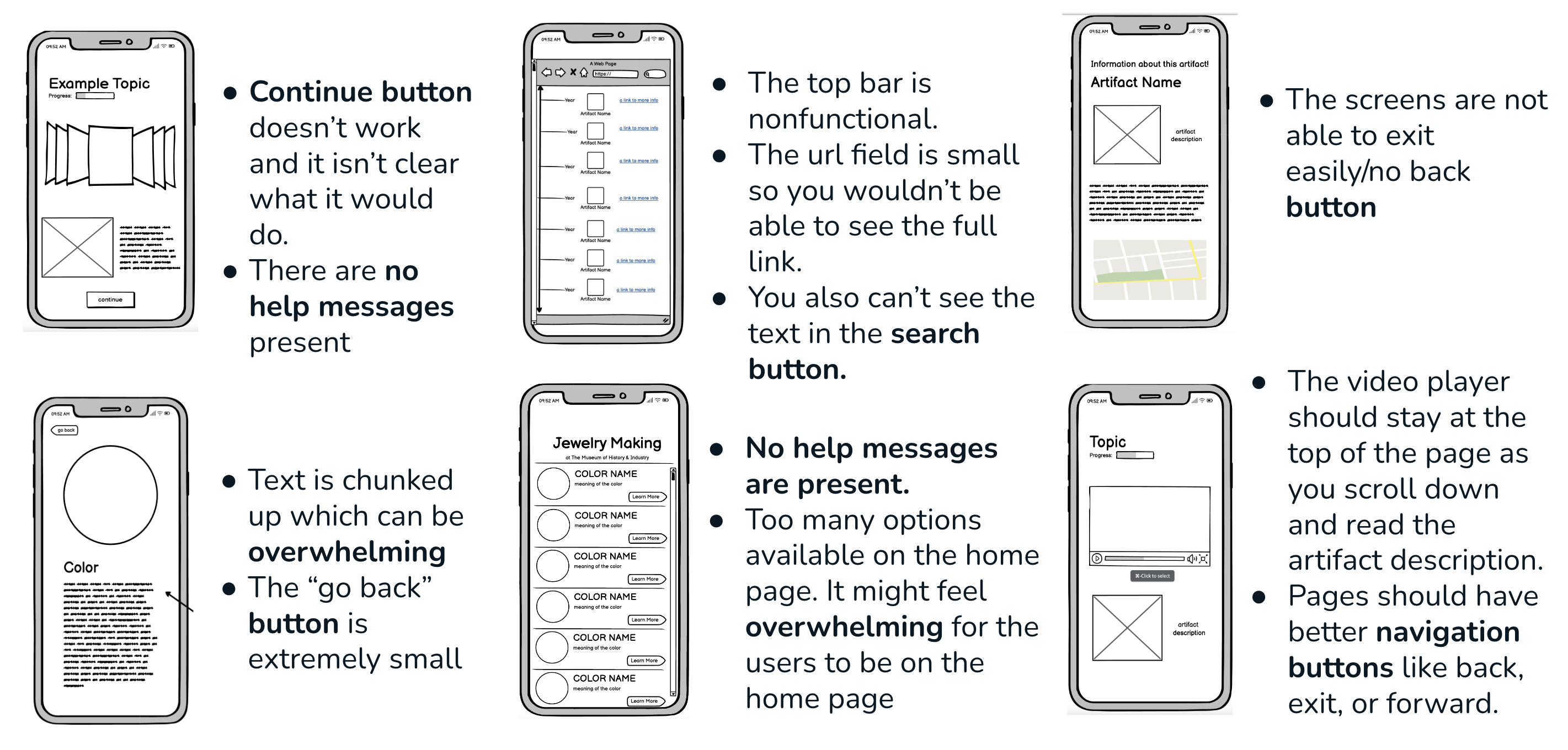
For our high fidelity prototype, we focused a lot on upgrading our previous model and making it more user-friendly and aesthetically pleasing.
-
We made it colorful and made sure to have access to the home page and a back button at all times.
-
We also made sure to upgrade to overall quality of the design by uploading photos and information.
-
We introduced some new features such as a “related” section which directs users to similar articles and similar jewelry colors.
Formative User Feedback Received:
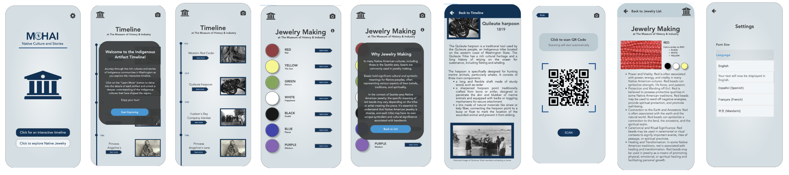
Changes we made during our final iterations:
-
We added a scroll feature to the timeline page which lets users easily navigate through different events by scrolling up or down.
-
We fully implemented the language settings, enabling the language feature to effectively work throughout the prototype.
-
We incorporated an animated arrow icon within the interface so that it visually indicates to users that the timeline is scrollable.
-
We implemented the design recommendation by telling users about the presence of similar colors and encouraging them to explore their meanings by clicking on them.